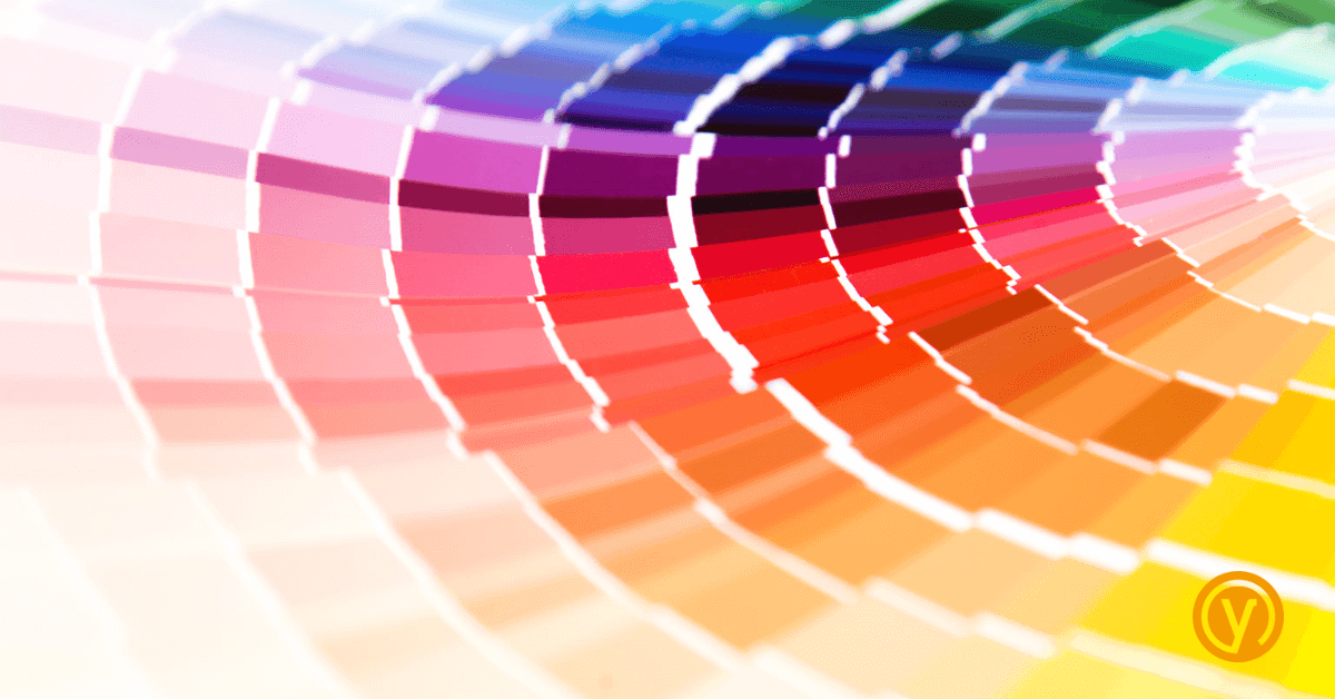
“Colour is a power which directly influences the soul” – Wassily Kandinsky.
Colour psychology is the study of how colours affect human behaviour, based on the principle that colours help to evoke different emotions and responses. Whilst researching this blog I was interested to learn that this is universal, across cultures.
How does colour influence us?
Colour can certainly impact our perception of a product or brand.
It’s unsurprising then that blue – often associated with calmness, trust and reliability – is widely used in the financial, charity and medical sectors. Red, on the other hand, tends to imply excitement and passion, making it a popular choice for sports, food and beverage brands.
It makes sense that businesses should use colour to their advantage, choosing ones that align with their brand values and that evoke the desired audience perception.
Think EasyJet. Their use of bright orange – for energy, enthusiasm and warmth – helps to convey a sense of excitement and adventure to potential customers looking for a fun and affordable travel experience.
On the other side of the colour wheel is The Body Shop. Their choice of green is understandable – nature, growth and harmony – and aligns with their commitment to natural and sustainable ingredients and cementing their values and foundation in ethical responsibility in the minds of their customers.
So are our responses actually chemical reactions?
The effects of colour on our mood and cognition are complex. It would seem that the reasons aren’t yet fully understood, but there’s thinking and research that suggests a few possible chemical reasons that might be responsible…
Different colours might, for example, have varying effects on the release of neurotransmitters in the brain – dopamine, serotonin, and norepinephrine. This could mean that exposure to bright colours such as red and orange increases the release of dopamine, associated with feelings of reward and pleasure. Calming colours like blue and green could stimulate the release of serotonin, a neurotransmitter involved in mood regulation and feelings of well-being and emotional stability.
Our brains process colour information through a complex network of neural pathways. Some theories suggest that specific colours might activate certain areas of the brain or stimulate specific neural pathways, which could lead to particular emotional or cognitive responses. So blue might activate neural pathways associated with relaxation and calmness, while red might activate pathways related to alertness and excitement.
Our emotional and cognitive reactions to colours can of course also be influenced by cultural, personal and learned associations. These can trigger the release of specific neurotransmitters or activate certain neural pathways in the brain. If you’ve learned to associate red with danger, for example, your brain might release stress-related hormones like cortisol when they see red.
There’s even evidence suggesting that women and men perceive colours differently – primarily due to genetic factors related to the structure of the eye and the brain’s processing of visual information.
Neuroscientists have discovered that women are better at distinguishing between subtle differences in colour.
(Don’t feel left out though… men would seem to be more sensitive to objects moving across their field of vision).
Should colour influence the design process?
Absolutely.
Colour impacts human perception and behaviour on a subconscious level, so as a designer I certainly select those that align with a company’s brand values and desired perception. It makes perfect sense to consider the power of colour and the influence that it can have on your audience.
If you’d like to talk about your business branding and ensure that you’re attracting your perfect customers, then contact us at hello@yellowyoyodev.wp.indigotree.dev, call 01908 980 400 or leave a message here.
Amanda


